Monday, 14 November 2011
Sunday, 13 November 2011
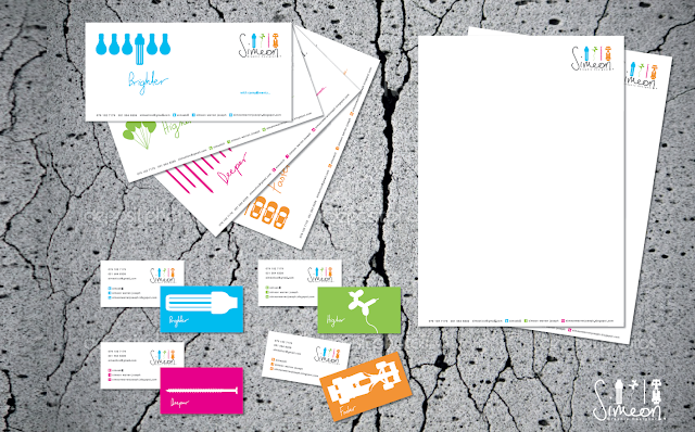
Self Promotion


The concept for my self promotion is based on me as a designer. I looked at four words that best represent me as a designer and differentiate me from the rest, that I would be able communicate visually. The words I came up with were “Brighter”,”Higher”,”Deeper” and “Faster”.
Brighter
Brighter
The word “Brighter” deals with me being a designer that is brighter that than the rest in terms of idea generation and the overall thought process. The visual I used to represent the word was a row of normal incandescent light bulbs and in the row is also an energy saving glob. I used this illustration as even though it’s very literal it also makes a statement of differentiation visually. The energy saving glob is brighter and more efficient which is what I am as a designer.
Higher
Higher
“Higher” represent the idea of no limits in my designs and me as a designer. (“The sky’s the limit”). This means that I’m not afraid to break a few rules and not “play it safe” to create better design. The illustration I used for this word was a group of regular balloons tied down and a different animal shape balloon that is loose from the group and is floating away “higher”. Again the illustration shows me different from the rest. The animal shaped balloon represents me as a fun playful energetic person.
Deeper
The word “Deeper” represents my ability to think deeper conceptually and development of a strong core concept in my designs. The visual used for this is the illustration of a row of nails vertically and a screw which is longer in the row. The screw is used to show differentiation; also the screw is more effective and stronger at binding than nails.
Faster
“Faster” represents the execution of my designs in terms of my technical skills and the ability to think quickly and solve problems efficiently. I used the illustration of cars as it’s a direct link to speed. The illustration consists of a row 3 regular cars and in the row is a F1 racing car which is much faster and more powerful. The illustration is 1 of my favorite as cars appeal to me and sometimes can be a source of inspiration.
Promotion items


Illustrations option 2


Promotion items


These are the packaging for my T-Shirts and my folded CV fits within it.

Coporate ID

Illustration and Concept Development
Illustrations option 2

Logo breakdown


Monday, 17 October 2011
Digital Painting

Batman - Digital painting done in Adobe Photoshop CS 5.5

HULK - Digital painting done in Adobe Photoshop CS 5.5
Sunday, 16 October 2011
Virtual Rides


Thursday, 6 October 2011
Project C.O.N.E: 20 Second Animation

The concept
For Project cone I decided to the topic 3. “Alternative energy sources (solar, wind and ocean power, etc).
Before this I had one other idea for the topic of overpopulation. The visual for this topic were of a baby eating a spherical lollipop on a stick which looks like the world. The baby represents overpopulation as people overpopulate the world by making babies. The visual of the baby sucking on the lollipop represents how in our world overpopulation is sucking the world of its resources and suffocating it. The reason I did not use this idea for my final animation was because the target market for this project was aimed at the younger teenaged community and Mtv views for which the idea was not light hearted enough to suit the target market.
Therefore I came up with my second final concept which I felt suited my target audience much better as well as send the message across with some humour. The topic 3. “Alternative energy sources (solar, wind and ocean power, etc). For my animation I wanted to do something with homour in it as it appeal to the younger generation. Another reason why I used humour was to not fall under the stereotypical “save your planet” ad campaigns which the public is desensitized to.
My concept is solar power. My animation starts of where you see an aged women roll on to screen at a moderate to less speed in her electric wheel hair which has solar panels on the back on it. As she comes to the middle of the screen the sun begins strike the solar panels causing her to charge up. This is where I had some fun showing the exaggerated effect of solar power. As the aged women becomes over charged by the sun she immediately jumps up out of her chair and begins brake dancing. Then she gets back in to her wheel chair and speeds of stage. This where the strap line come down “Get solarised feel the power” reiterates the massage of the use of solar power. My Logo on the right uses the image of the clenched fist to show a sign of power and sun represents the type of power. Therefore communicating we have the power of the sun in the form of solar power. I did the logo in this style as it is in line drawing which is the same as the animation so it ties up.
Process work


Wednesday, 21 September 2011
Cook book design

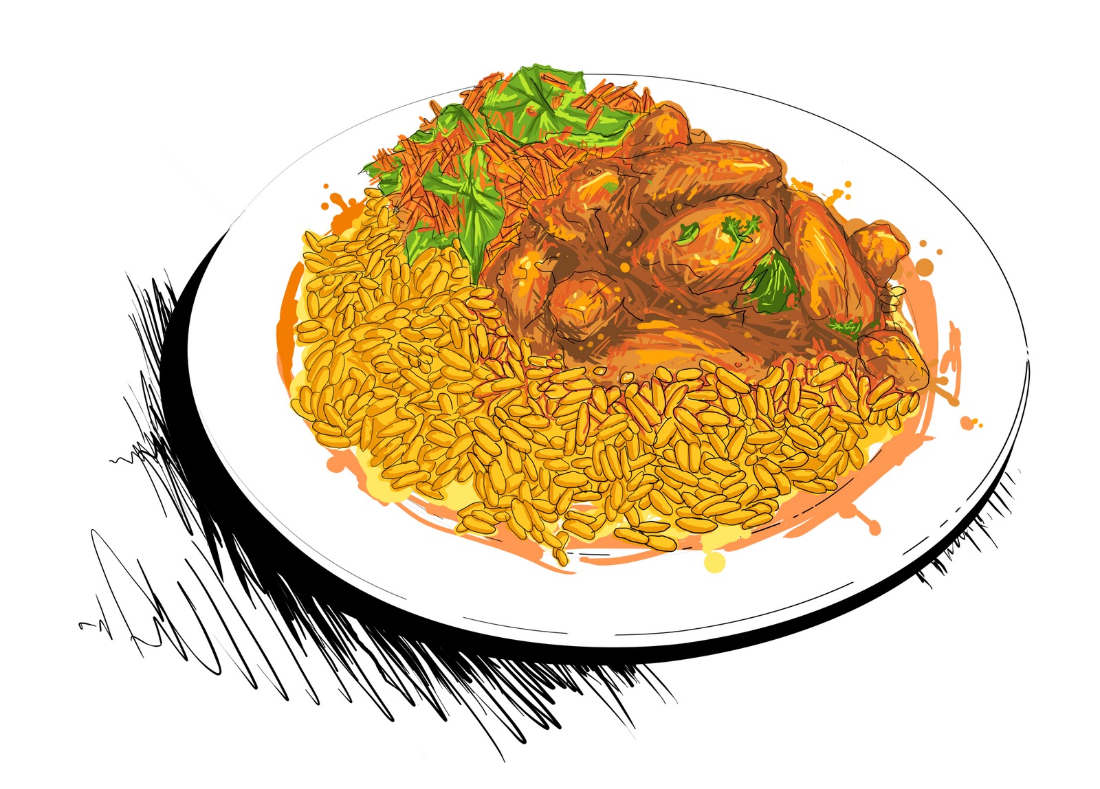
The concept and theme of my cook is "South African Indian Cuisine". I used my mother who is otherwise known as aunty Rachel to the neighborhood. She cooks traditional indian food with a South African twist.
For my cook book I used the dimensions of a square 210mm x 210mm. I did this because most books are rectangular in shape and if this book were on the self with the others it would be noticed easily.
For my cook book I used the dimensions of a square 210mm x 210mm. I did this because most books are rectangular in shape and if this book were on the self with the others it would be noticed easily.
My cover is 215mm x 215m its is 5mm x 5mm bigger than the page format as my book cover will be in a hardcover form. The spine of book is 20mm.


Step 4: Once the illustration is completed a solid colour background is applied to the illustration and image is save as a .jpg to be placed in the indesign layout.
illustrations


Index

Introduction

Recipe 1

Recipe 2

Illustration process

Step 1: take a photograph of image to illustrate. Place in Photoshop and make opacity 60%, then I created a new layer and using a normal round brush at 5 pixel size began redrawing the line art of the image.

Step 2: I then began to add flat base colour to line art and by picking colours from photograph and from swatches palette.

Step 3: using the different colours I began to show tone and texture and enhance the overall look of the image to make it look more realistic. All my painting was done using a solid brush to give my illustration a unique stylized look.

Step 4: Once the illustration is completed a solid colour background is applied to the illustration and image is save as a .jpg to be placed in the indesign layout.
Fonts Used


Wednesday, 31 August 2011
Editorial Illustration


Magazine chosen for layout:

DPS from magazine

The above DPS from the “one small seed” magazine that I used as reference contains grid layout that consist of 2 columns per page. The image is offset 2 thirds of the centre of DPS, making it interesting visually.
Fonts used in Editorial


Fonts used in Editorial

Illustration Development
Rough Ideas


The picture to the right is how I tried to show my idea. To convert my idea into a visual illustration a used the idea of 2 roads where you have to make a choice. The roads represents different paths that you could have chosen and the things that could or could not make you happy.
In the above illustration I used the image of hands to show the idea of deciding but later didn’t used the hands because if u see the image of two paths in front of you, you will evidently have to choose 1.
Development of final illustration
For my final illustration I decided to used Adobe illustrator


Then I began to develop a background for my illustrations.

Once all illustrations are completed I then began placing them and adjusting them on my illustrated background so that it visually represents my concept.

Final Illustration

Subscribe to:
Comments (Atom)